
The bar graph was the first visual representation I created. The bar graph is an important visual in that it shows the amount of time spent in each category side by side. This graph allows the viewer to see a comparison of activities vs. hours spent in each activity. This differs from the pie charts that I created because charts show the percentage of time spent in each category, not the actual hours. When many activities are being visually represented with various amounts of time spent in each, a pie chart takes all the information and shows how the activities were dispersed in comparison to the whole; the pie.

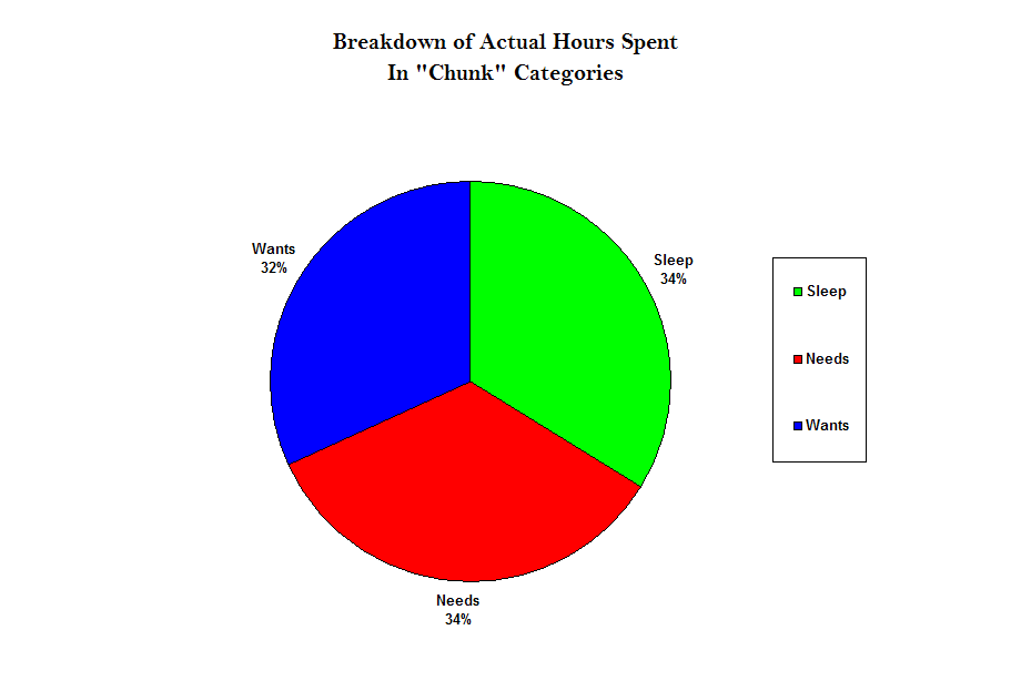
The second pie graph, which showed how my time was “chunked” in three essential categories (needs, wants, and sleep), visually represented how much balance there was in my categories. From this chart, one can see that I balance my time between things I have to do (needs) at 34%, activities I do in my free time (wants) at 32%, and sleep being the third category at 34%. I manage to get all my work done and balance it out by going out with my friends. By the end of the night, I am getting the rest I need to balance my needs and wants. School, studying, and work are priorities whereas going out with my friends, spending time at the gym, and personal hygiene are all things I do after my main concerns are taken care of. These graphs allowed me to visually see my time management skills.

